Home

Thursday, April 30, 2009

Sometimes Cool shit happens at random


Well i was just doing some weekly tutorials. this time an easy one compared to my last few. However, it was an important one none the less. Tutvid is the SPOT! this tutorial was about brushes and swirls. The important thing is the brush part. For whatever reason i totally forgot that adobe illustrator is an ILLUSTRATION program. DUHHHHH right? well lots of class and lots of other shit going on makes one forget. Im so baffled about what graphic art really is. it seems like a compilation of so many mediums all smashed together into one big awesome form of art, where the possibilities are endless. This is where my point comes into play... Illustration is not only done with the pen tool! haha. and tonight i realized that. i made a rad brush and it looked like this crazy bunny character i always try to draw. so with some tweaking and some cool brushes i made a rad little character. plus some tutorial awesome-ness. So while this slow ass, crap wireless Internet, that sounded so appealing at first when i got this apartment is loading ill do some more rambling... This tutorial showed me how to create and tweak my own brush. but it also taught me basic things that i overlooked. like pasting in front stuff like that. control c -- control f. pretty neat haha. i also learned about some little hot keys that rule. what merging stuff does. expanding appearances, to change colors in a brush so its not a solid color, stuff like that. i also browsed over a few other tutorials but they were far less appealing. Seriously go to tutvid do all the tutorials! its really taught me a shit load about this program. bummed that were done with it for this class i want to learn everything there is to know about illustrator! i looked over a few others but did not have time to do them all. Tutvid tutorials are pretty in-depth, and take way longer than just pen tooling over  a tennis ball or something. I bust my ass to just tutorial it up. but i much rather spend two hours on a tutorial worth a shit then just read over some rocker ass dudes tutorials on youtube. so there is my ramble. peep my work, and presentations tomorrow yayyyy. oh and the bunny i made was made all with brushes,except the teeth are pen tooled haha.

oh and check out this tutorial as well, i looked over it in class, and again at home but didnt do it. it didnt really seem worth it, but it gave some more pen tool pointers, and how to do some gradent work. kinda ok. either way learned some new stuff. tutvid.com again.


and I'm not gunna lie, i kinda said it before in this post. I think its good to look at tutorials and just read them and whatnot, but following along and doing the tutorials makes it worth it. check tutvids. mess around. even if the tutorial doesnt really seem like your getting anything to crazy out of it you still get some basics. Every tutorial i learn new hot keys, little pointers on stuff that i may or may not use. However, the info is all there, and there is nothing wrong with learning new stuff! haha

Tuesday, April 28, 2009

"Just doin what I do" lifestyles of the poor and haggard


So life for me is hektic for a few reasons, and this is not a sob post about why people should give a crap, because frankly, there are people that do wayy more than me. Anyways, school all week, 3 studio art classes art 117 art 118 art 120, spanish 201 and another weird PSU required corse. Fortunately all these classes are rad as hell so its all gravy. I ride bmx and like to shred jumps in the woods. Me and my buddys have been doing this for years some more than others. I have met people from around the country, and around the world. All because we share a common interest, and love. (Riding bikes is about 95% of the reason i ended up in Oregon) We build these elaborate set ups in the woods. Jumps! Tons of them, thousands of man hours go into these spots, and usually get plowed. Some stay for years and years, some are world renowned some suck. But as far as trails go the east coast where i grew up till i was 18 and the northwest is the spots to be!. Its our zen and no one gets it. We dont really go to the skate park often, all though thats fun, we rather be in the woods with a bmx bike, a six pack and some shovels compiling this massive dirt jumps just so we can ride for the few months it doesn't suck out. Here are a few shots of my local trails back in NY, and the jumps here in good ol' Oregon..... and keep posted to see video sales and shit for the people who dedicate their free time to building jumps, and just being underground. We dont do it for the money, all though some do have some big sponsors which is rad. We just Dig and ride jumps for the pure love. To feel that weightless moment in the air, where ur flying 20 or 30 feet far and 15 feet in the air is like nothing else in the world. Along with this come injury and sometimes, unfortunately worse. Ive seen the biggest names be crumbled to nothing all because of one crash, but u know what, if those dudes could get back on a bike, they wouldnt think for a second about passing up the offer. We sighed up for it, so until that day comes keep doing what your doing and lovin it. So what im really getting at is we are sculptors of dirt and masters at fun haha. that was lame. But really we just are doing what were doing. and lovin every minute of it. so my point is, when im not bustin my ass during the week, you can catche me dippin into the woods, livin the life, and riding some bikes.

Thursday, April 23, 2009

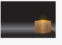
The finish product of the box tutorial, and some flames added

Once again this tutorial kind of followed up on making masks, what they do.
How to add some really cool effects just with simple stuff.
tutvid.com tutorial.

this is what i produced!
its pretty much the same stuff the guy on tutvid has.


Making Cards, and holeyyy tutuorialss!


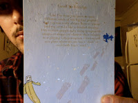
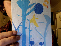
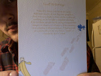
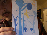
Ok well school since 8 get out at 5. run to art media get a ton of diffrent papers, and its time to experiment! after a lot of paper jams, and a few more quick dashes to art media i compleated my five cards. ill take pictures of 2 cuz even though i used 4 types of paper. i think these are the two most succesful, and pretty interesting.   

one is a wild like thin mixed paper deal, with some wird like gold blotches on it, the 
other is a matt heavyer toothed paper. its not white kinda off whiteish.

Next is my tutorials, and wow i spent really long on them.
The first one im not going to post a pic because it was worthless. it was a pen tool exercise. i was looking for like an advanced pen tool exercise, instead i found this one!

 and here is my final product

I am not sure when i am going to have to make a box like this however!
I learned so much from this tutorial it was wild! it took about an hour and a half.
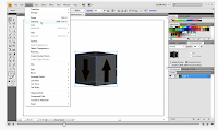
but i learned about how to mess with layers way more! gradients, and grouping, ungrouping the list goes on. How to make masks, what these masks do. There is so much to this box i didn't even think it was going to be this intense. 
I will probably have to look over it again and again because there was sooo much information.
but this was the best one i have done yet! it was really fun. and my final product pretty much is a exact replica of the guy on tutvids.com. mine is the one in this post.
I strongly recommend people to do this one because everything u learn in the process can help u out way more just with basic illustrator things. i wish i could do my geoff mcfetridge card after watching this vid just because the stuff i learned about layers and shadows and stuff.
wooo.

Tuesday, April 21, 2009

Reflecting on my Geoff McFetridge Card

This project was really important because i started to really play with illustrator.
I began to create work based on sketches and research. i really enjoyed having to
figure out what my artist did, and how he did it, and try to incorporate this into a final product.
I was really pumped because this project made something I'm doing for 118 much easyer. and the other 
way around. I think its cool how the whole class put out some really good work, and I'm excited to do more
with this program as well as look more into this artist.

Thursday, April 16, 2009

Weekly Tutorials


For this weeks tutorial i did the live trace tutorial on tutvid.com.
It was really helpful because the dude explained how to tweak the settings so we did not just have a stock box deal. I had to dl this folder with two pictures, wich was available on the site. It helped me a lot even though i didnt use it for my card/ geoff mcfetrdige project, i deffinatly am using it for my art 118 class. The tutorial was about i think like 30 min. it was well worth it. it really made it all make sense, not to mention kate also gave a demo on this in class. doubble wammy.!

Photos in The mail!

I have been back and forth from oregon to new york for the past few years. and over the moves i have sent my photos back and forth. well finally i got my stuff sent to me. When i was  a senior in high school i took an amazing senior experience art thing. I chose to spend the year shooting and developing photos around a theme. I chose to take photos that made people feel as if they were dream like, and overall just odd stuff. We decided that surrealism was not a good name for the photos i shot and they were just there own thing really. i have all these photos mounted set up in series and like ready to go to a show haha. i want to start posting them on this blog and my flickr and possibly get my work out there. i mean why not right? i have not shot a photo in 3 years im  not sure why i suppose i went thorough a block where i just had no ambitions. well now i am really eager to just explore everything and i want to get my stuff back in action. so this is my first step. please look back soon, i will be posting a series every few days, and explaining them and talking about what the hell i was thinking when i took the photos and whatnot. so check back!

woahh My card


"Like ive done you know so many diffrent kinds of yeti/ big foot graphics.
and you can really reduce them to almost
nothing, or to be like a detailed drawing. i try to draw
people in by using recognizable images or shapes or whatever then twisting it or playing 
with perception."

Tuesday, April 14, 2009

Live Trace and Our First Project

well i got the wrong software for my printer scanner deal some while back. so guess for now I dont have a scanner. So i just took a sketch and then just live traced it from a picture in photo booth. Im not sure what or even if it has anything to do with the next project. but i may use some ideas and elaborate. this is the first stages of anything, more so the first stages of using illustrator. 

SHIT INTERNET UPLOAD THE PICTURES WHEN IT DOES NOT SUCK.
sorry......

Monday, April 13, 2009

Artist of Choice


I chose to study and get inspired by Geoff McFetridge. How can i start? well his work is awesome. Its really really inspiring
to me on a personal level.
I ride bmx bikes and its not only my passion but kinda a big chunk of my life.
I grew up around that culture, of being the reject to society because some sport i chose to do
that broke the confines of traditional sports or whatever.
"Geoff McFetridge is a graphic designer and visual artist based in Los Angeles" stolen from this site check it out. here is a few pieces of his work.
We watched a rad video in class on him as well.
i defiantly have a pretty creeper mustache, a bit inspired by him as well.
so i suppose im going to just really get into his work, and try to make this greeting card work.
i have a few ideas and sketched a few things. I cant import them cuz my scanner is messed up, so ill probably just do it in class tomorrow morning.
wordd 
night night

just got cs4 designer suite!

F'in pumped bloggin from my phone. Buisy as hell. Will post my designer of choice and info about him tonigh. Moms in town and have way too many classes check back tonightttt!

Friday, April 10, 2009

Final Four Type Designs!


This is the revised E design. Once again its size 72. The font is "stencil font"
I really wanted to make use the negative space to create interesting movements.
I think its much more successful than my first design.


This is a revision of my original design. It was really poorly aligned at first so i decided to really switch it up. i took the parts that lined up the best and simplified the design. i like the feel that you get sort of like brick work. 


This is the revised number 2 design. Font size 72 and the font is
Imprint MT Shadow. i spaced the 2's out better and switched up the alignment
a bit. Its not so repetitive, but still a pattern.


This is the original design i made with the font bickham script pro.
Size 72 and capital J. There is something about script that is traditional and beautiful.
I think its really awesome to make a pattern out of such a beautiful font and attempt to make it just as appealing if not more in the end. i think this is a successful one because there is so much going on. there are similar patterns and ones that vary, which personally makes the pattern less boring and does not take away from the composition of it.

Wednesday, April 8, 2009

heart tutorial


for whatever reason my heart tutorial screen shot didnt show up so here it is!!

Weekly Tutorials


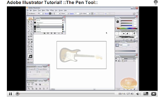
So this week i found some time after class and earlier today to do some awesome tutorials. The one I was really pumped on was this one i found on google videos. Its about a half hour long tutorial on the pen tool. and all though i am far from knowing much about the pen tool, i can say after this tutorial i know the basics pretty well. you can find it on youtube. Adobe illustrator pen tool tutorial. I really recommend it, unless you are already a master with the pen. The one tutorial i did not find so helpful was the one on the 120 site, the vectortuts tutorial. I think its cuz there was no audio or video. I personally think it is much easier to work with someone rather then just be taught by reading. 


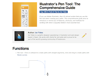
Another good tutorial i found was again a pen tool one off google. its pretty long but pretty

 awesome and very helpful. Pretty good! go try it here.


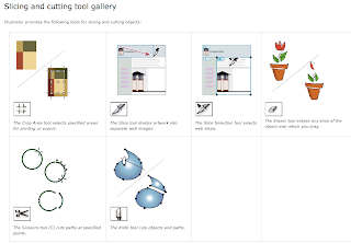
Two others i did were the slicing and cutting tool gallery and the crop tool tutorials. They were pretty informative. the crop tool i already was aware of due to other programs with a crop tool. the slicing and cutting tool was interesting, the possibilities are really opening up for me with all these tutorials. Pretty excited to start using them with some of my own work...

Monday, April 6, 2009

Weekend Skavenger Hunt........ Artist 5

 The next artist and the last one I looked at was Tim Biskup and I was pretty drawn into his work. I cant get the picture up on my blog for whatever reason but the link above will take you right to the piece i am talking about. This piece appealed to me for two reasons. One because of of its beauty, and the second because it relates to a project i have due for my intro to communications class (118). We are making pieces using simple geometric pieces, squares, rectangles etc. This guy makes all these shapes relate to a painting of a skull. He calls his piece "Doom loop # 1". Its a rad picture because the colors are so warm and inviting and you really have to stare at the painting for a while to figure out what it is. To be totally honest it may not be a skull, but it really looks like one, and the title gives the viewer a hint.
  I think that being able to make such a complex painting out of such simple shapes is amazing. It is not only really difficult, it takes a lot of thought and really good execution. I am really impressed by all of this guys work, but this one really stood out to me. I think       that everyone should take a long hard work at more of Tim's work because it is really, really good!

Weekend Skavenger Hunt........ Artist 4


The next artist I chose to talk about is Banksy. Banksy for the people who don't know is an amazing street artist with a identity that is still to be found out. He has done amazing stencil work around the world and the whole time under a hidden identity. His work has extremely strong political meaning, and you will never find an image with out a tremendous amount of meaning behind it. This piece was found on a news web site called dailymail with the title "Graffiti artist Banksy strikes again - in Bethlehem". The guys art is so jaw dropping I don't know where to start. This image is probably one of my favorites. Its a little girl patting down a solider in Bethlehem. During all these holy wars that are going on in the area Banksy finds time to make a political statement that is not only shocking with its meaning but the image as a whole. Stencil work is amazing and he is nothing short of the master. (at least i think so) The solider is so much larger than the little girl, however this little girl still has all the power. The solider is disarmed and helpless, and for once seems to feel a bit vulnerable, much like the little girl would if this was the other way around. I think that this image is so successful because of where it was placed, and the meaning behind it. Please look at some more of Banksy's work, its so amazing and needs to bee seen and understood. This art form is extremely appealing to me. Street art takes skill and guts. Not everyone is willing to risk getting arrested to make a statement, Banksy is.

Weekend Skavenger Hunt........ Artist 3


The next artist I found while looking around the poppy talk blog. His name is Matt Furie. This work is so awesome for so many reasons. His work is not only comical, but when u really start looking at it you realize how rad his work is. His drawings have so much texture to them it really draws your eye to his work. I found this image really interesting because it immediately caught my eye. One bike has a piggish monster on it, while the other has a human body and monster head. I cannot get over the colors used. they once again are pretty simple but really pop out and bring the viewer into the piece. the two bikes one red and one purple are the most interesting to versions of the colors I think i really ever seen. Almost a bit muted, but still very vibrant. Its pretty awesome. I love how the monster creature on the right is just gawking at the guy on the right. And once again I cannot stress it enough the texture he put on the monster is so detailed and awesome but u still feel that its a cartoon-ish character. This piece really works for me because the detail put in it makes the image so much more interesting but does not distract the viewer from the other aspects of the image. Its gives me a sense of street art. This would be awesome if it was blown up on some side of a building somewhere.  check out his site its defiantly worth it.

Weekend Skavenger Hunt........ Artist 2


The next artist is once again from the grain edit site. His name is Frank Chimero, and his work is once again nothing short of amazing. The picture I Chose was so appealing to me. Again because of its simplicity, but this time there was more. The message in this is pretty cool. "Says hope spreads peace". Obviously the only thing that's spelt out is "hope spreads" but the next image is a peace sign and a dove. The colors are really interesting to me. They are these muted yellow, and a muted teal color, or blue-ish color. I really like the flame on the match and how the piece is not the same size on both images. It is almost like a dip tick image you would see in photography. The simplicity of the hand a and the book of matches should not be overlooked however because there is  a lot to the images. The shapes are really interesting because they are obvious, but simplified to a way where the detail does not take a way form the meaning of the image. I encourage you to read franks interview on this website, its really good and sheds some light on the designer behind all the work.

Weekend Skavenger Hunt........ Artist 1


What i really love about design... Well I have always been super hyped on photography and street art. When i had the opportunity to get into graphic design I jumped on the opportunity. I love messing with computer programs and incorporating art forms from all walks of life into one. So to me this is design, it can be super simple or extremely complex.
I came across this artist by the name of Adrian Johnson on the grain edit web site. His work is super awesome and really shows how simple or complex a design could be. Out of all the images I chose this one, well i guess "these ones". each of these really interests me because of their simplicity. Very simple shapes are all combine to make awesome designs. The cloud is my favorite because of the colors. For whatever reason simplicity really intrigues me. there is blue and red, pretty simple right? well to me it seems much more complex. After reading his interview on the website it further proves that sometimes the simple things have way more meaning than most people think. I enjoy how some of the images he uses text and others are left to be more self explanatory. Design to me is making something simple, such as geometric shapes, or illustrations into something more complex. I think that  Adrian Johnson does a really good job at proving this.