Home

Wednesday, April 8, 2009

heart tutorial


for whatever reason my heart tutorial screen shot didnt show up so here it is!!

Weekly Tutorials


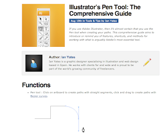
So this week i found some time after class and earlier today to do some awesome tutorials. The one I was really pumped on was this one i found on google videos. Its about a half hour long tutorial on the pen tool. and all though i am far from knowing much about the pen tool, i can say after this tutorial i know the basics pretty well. you can find it on youtube. Adobe illustrator pen tool tutorial. I really recommend it, unless you are already a master with the pen. The one tutorial i did not find so helpful was the one on the 120 site, the vectortuts tutorial. I think its cuz there was no audio or video. I personally think it is much easier to work with someone rather then just be taught by reading. 


Another good tutorial i found was again a pen tool one off google. its pretty long but pretty

 awesome and very helpful. Pretty good! go try it here.


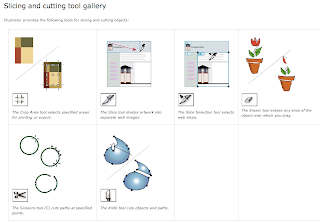
Two others i did were the slicing and cutting tool gallery and the crop tool tutorials. They were pretty informative. the crop tool i already was aware of due to other programs with a crop tool. the slicing and cutting tool was interesting, the possibilities are really opening up for me with all these tutorials. Pretty excited to start using them with some of my own work...

Monday, April 6, 2009

Weekend Skavenger Hunt........ Artist 5

 The next artist and the last one I looked at was Tim Biskup and I was pretty drawn into his work. I cant get the picture up on my blog for whatever reason but the link above will take you right to the piece i am talking about. This piece appealed to me for two reasons. One because of of its beauty, and the second because it relates to a project i have due for my intro to communications class (118). We are making pieces using simple geometric pieces, squares, rectangles etc. This guy makes all these shapes relate to a painting of a skull. He calls his piece "Doom loop # 1". Its a rad picture because the colors are so warm and inviting and you really have to stare at the painting for a while to figure out what it is. To be totally honest it may not be a skull, but it really looks like one, and the title gives the viewer a hint.
  I think that being able to make such a complex painting out of such simple shapes is amazing. It is not only really difficult, it takes a lot of thought and really good execution. I am really impressed by all of this guys work, but this one really stood out to me. I think       that everyone should take a long hard work at more of Tim's work because it is really, really good!

Weekend Skavenger Hunt........ Artist 4


The next artist I chose to talk about is Banksy. Banksy for the people who don't know is an amazing street artist with a identity that is still to be found out. He has done amazing stencil work around the world and the whole time under a hidden identity. His work has extremely strong political meaning, and you will never find an image with out a tremendous amount of meaning behind it. This piece was found on a news web site called dailymail with the title "Graffiti artist Banksy strikes again - in Bethlehem". The guys art is so jaw dropping I don't know where to start. This image is probably one of my favorites. Its a little girl patting down a solider in Bethlehem. During all these holy wars that are going on in the area Banksy finds time to make a political statement that is not only shocking with its meaning but the image as a whole. Stencil work is amazing and he is nothing short of the master. (at least i think so) The solider is so much larger than the little girl, however this little girl still has all the power. The solider is disarmed and helpless, and for once seems to feel a bit vulnerable, much like the little girl would if this was the other way around. I think that this image is so successful because of where it was placed, and the meaning behind it. Please look at some more of Banksy's work, its so amazing and needs to bee seen and understood. This art form is extremely appealing to me. Street art takes skill and guts. Not everyone is willing to risk getting arrested to make a statement, Banksy is.

Weekend Skavenger Hunt........ Artist 3


The next artist I found while looking around the poppy talk blog. His name is Matt Furie. This work is so awesome for so many reasons. His work is not only comical, but when u really start looking at it you realize how rad his work is. His drawings have so much texture to them it really draws your eye to his work. I found this image really interesting because it immediately caught my eye. One bike has a piggish monster on it, while the other has a human body and monster head. I cannot get over the colors used. they once again are pretty simple but really pop out and bring the viewer into the piece. the two bikes one red and one purple are the most interesting to versions of the colors I think i really ever seen. Almost a bit muted, but still very vibrant. Its pretty awesome. I love how the monster creature on the right is just gawking at the guy on the right. And once again I cannot stress it enough the texture he put on the monster is so detailed and awesome but u still feel that its a cartoon-ish character. This piece really works for me because the detail put in it makes the image so much more interesting but does not distract the viewer from the other aspects of the image. Its gives me a sense of street art. This would be awesome if it was blown up on some side of a building somewhere.  check out his site its defiantly worth it.

Weekend Skavenger Hunt........ Artist 2


The next artist is once again from the grain edit site. His name is Frank Chimero, and his work is once again nothing short of amazing. The picture I Chose was so appealing to me. Again because of its simplicity, but this time there was more. The message in this is pretty cool. "Says hope spreads peace". Obviously the only thing that's spelt out is "hope spreads" but the next image is a peace sign and a dove. The colors are really interesting to me. They are these muted yellow, and a muted teal color, or blue-ish color. I really like the flame on the match and how the piece is not the same size on both images. It is almost like a dip tick image you would see in photography. The simplicity of the hand a and the book of matches should not be overlooked however because there is  a lot to the images. The shapes are really interesting because they are obvious, but simplified to a way where the detail does not take a way form the meaning of the image. I encourage you to read franks interview on this website, its really good and sheds some light on the designer behind all the work.

Weekend Skavenger Hunt........ Artist 1


What i really love about design... Well I have always been super hyped on photography and street art. When i had the opportunity to get into graphic design I jumped on the opportunity. I love messing with computer programs and incorporating art forms from all walks of life into one. So to me this is design, it can be super simple or extremely complex.
I came across this artist by the name of Adrian Johnson on the grain edit web site. His work is super awesome and really shows how simple or complex a design could be. Out of all the images I chose this one, well i guess "these ones". each of these really interests me because of their simplicity. Very simple shapes are all combine to make awesome designs. The cloud is my favorite because of the colors. For whatever reason simplicity really intrigues me. there is blue and red, pretty simple right? well to me it seems much more complex. After reading his interview on the website it further proves that sometimes the simple things have way more meaning than most people think. I enjoy how some of the images he uses text and others are left to be more self explanatory. Design to me is making something simple, such as geometric shapes, or illustrations into something more complex. I think that  Adrian Johnson does a really good job at proving this.