Home

Sunday, May 31, 2009

so summer time is here!!!

soooo you know what im not alone here, this is for everyone that busts their asses live it up! haha. taking 18 credits and 12 of those are studio art classes is tough, taking spanish and taking a sophomore crap class is rough, but for all the rough stressful shit that happens there is good. I have awesome teachers, and i couldnt be more happy, i got a rad little dog, and good ass friends. this weekend was full of drinking and real talks. livin it up and just Chilen. i have this balcony deal shown below. seems like it would be pretty grimy, but throw a rug and some homies in the mix and party time. my apartments are pretty ratty, located on 12th and alder. However, everyone that lives here is so f'in rad, no one will ever complain about anything. on any-given night some one else is being way to loud. I know im going on tangents, but hey im excited and got a few sessions in me haha. Just playing with a crap point and shoot digi cam. showing the people who look at my blog (who are probably few) whats up. slept out here every night, why sleep inside? thats way to easy. plus the parking garage goes right to my back window. this could potentially be sketchy as the day is long, but its so convenient. so screw it! good spiritts, friends and beer. class all summer but it will rule really hard. just loving life and kickin it. expect a zine coming in july if i can get my shit together, its going to be real. 
signing out, 
Pauly!
Laters


lightssss

kinda a big deal
mo curled up in what looks like a copy pasted blanket

tyler and mo just wrapped in a blanket. way to many bags of beer cans haha.

Thursday, May 28, 2009

Finally some time for tutorials

So its been hectic these past few weeks and tutorials have been at a minumum, but with classes winding down and projects getting finished i can finally bust some shit out! 
So at first i was pretty not psyched on the "you suck at photoshop" tutorials, however the past few i watched were really good and really helpful. Kind of heartwarming. so here are some screen caps are what i watched, and the one i did was really good. it was using paths to make a selection and make a mask, or delete out the background.

So this is my version of the selecting using the paths. I really was happy with what i accomplished, this makes it really easy to delete out the background and keep the background of the other layer.

This was a pretty simple tutorial, kinda a fun one. It just explained how to use the liquify filter, you could potentially make some one look fat or bloated. Haha its pretty funny. there is more you could do with it i suppose, either way its good.


This tutorial also was very helpful. I enjoyed working with the patch tool, and the healing tool. It is nice if you ever wanna cover anything up, or like fix something. In this case the dude was fixing some wrinkles and blemishes. it was pretty good.

This tutorial once again haha, was good. It makes it so you dont have to select an image with the wand tool for hours. using the color range to select makes complex images such as the mesh lacing in the hamock easy and possible to delete the background.

This tutorial i sware ive done before, but i redid it. It just uses the clone tool to hide that bag in the background. It was ok, short and kinda helpful.


Youtube.com 
You suck at photoshop.
Check them out!
They have a playlist for them and its legit.
Laters

Hand made images take way longer than you think.... 2

Here are the last five images. Check my FLICKR to see these images in order and not all thrown about my blog.


This one is mixed media. I took a computer genenerated image and a hand made and put them together. I think it came out really cool for two reasons. One it adds an awesome texture to the picture and secondly they line up really well. In the original hand made image everything was backwards because of the xerox transfer. I really liked how it was backwards, it gave it a photo negative feel. I also liked how when it was mirrored in photoshop how cool it looked too.


I started attempting to make an image out of solely hand drawn type. i started to realize i dont really have any recognizable shapes to do this. So ultimatly i had to add some detail so people can realate the images back to my original one. just played around im kinda into it either way. 


This image is once again a combination of the image about with the origina image. The type image is just really opaque and does not show all the way through, i really like the effects.

This is a xerox transfer on this cool paper i got at art media. its kinda this shiny weird textured paper, again the print looks really cool in person, i think that it lost some of its hand done feel when it went through the scanner. 


This one is a marker sketch, i did one with a marker earlyer where  i just totaly blackened in the dark area on an already printed image. this one i did from once again tracing some of the main shapes and going from there.


For my book i am going to keep all my hand made stuff hand made. I want there to be a obvious difference in computer generated art, and hand made generated art. I really like the feel of work that is not "perfect" i mean there is a time and a place to make things perfect and neat, and have a good out come. For me when it comes to hand made stuff the errors in the work are the things that are the most cool. I am not compromising craft and overall appearance of my book. Im just saying for the actual images, i want to keep them hand done. So the only reason i scanned them into the computer was to colabo some with a photoshop document, and to show you guys. 
kk laters,
Paul

Hand made images take way longer than you think....

So its 645 am, but don't worry i have not been  up all night, i got to bed at 2 haha. and got a few hours of sleep. pretty much just making different hand manipulated images. I kinda had it hard for-myself because in the beginning of the project we were told to get an object/image that would be easy to like select, repeat, and take a part, i took a whole photo, so ahhh, but its been good. so here are my final hand drawn images.


This first one is my interpurtation of an ink stipple. i pretty much just dotted it up and made my image, i tried t make it as best as i could, but dotting the paper with a pen really takes longer than you think. i like the way this one came out because even though its chaotic you can kind of still tell what it is, and when you see it next to the original you will totally understand what it is.


So when i was at art media on like thursday after class i found this really really awsome paper, it had an awsome texture and was really transparent. After i found out we could do xerox copies i snagged the paper and the xerox marker and just went t town. Again its so faint but i really like the way it came out, almost looks stenciled on. 


This image started as an idea to lightly scratch my image into this cool paper i had. after that i was going to put another piece of paper over it and lightly shade the paper, then like the image would come through, forgot what thats called. Anyways obviously it didnt work. i had a protractor and just started scratching the hell out of all the black space. my original idea was to not use ink, and just see the image through the smooth paper, and rough scratched paper. it was starting to not work, and it took me too long to give up on, so i decided to just throw some india ink based pit pen on it and i think it worked out better.


So i was striving to finish my last 10 handmade images and i forgot i didnt even do a pencil based image. i wanted to make this look as real as possible so i basically traced over my picture. i was sick of striving to draw a half assed picture. So i decided to just trace main outlines than go from there. I enjoyed doing it, and it kinda looks crappy when i scanned it, i think its just the pencil and the texture of the paper.


This one was made during my block of not knowing what to do. I think i had two images left. i wanted to add colored marker with the xerox copy. i didnt want to draw out my image again, i was frustrated. i scribbled some colors that i thought were cool and xerox copied right over. i was not so frustrated when this was done, i kinda liked it.

Tuesday, May 26, 2009

owie! and some work haha

well fuck way to start the summer off pretty sure i destroyed my knee. im trying to get an mri but school is in the last two weeks so it might be a bit of a ball up. o well, got my dog, my computer and my health well kinda... so try to stay positive. we been filming a lot for my buddys video, and let me tell you its going to rule. 
That had nothing to do with art 120 sorry, but this does.
So i finished my first 5 of my hand manipulated images, i know we are suposed to have 25 images for my class tomrrow, but its just physically impossible, im not a happy camper... haha. ok any way these were rad, and it will be easy to do the rest of them in class, i need this zerox copy pen thing, and i couldnt get it at art media on friday, well because im an idiot and forgot really. so anyways here they are....
The first one is my attempt at a pen sketch, i think it came out pretty cool. pen is a cool way to sketch cuz when u mess up you either have to start over or work around it, it almost reminds me of giving some one a tattoo minus the starting over part. i found this really cool paper at art media, and ya i just cut it to 7.5 by 7 inches and sketched away from the picture i was looking at on my computer.
I bet you are all wondering what this one is... well you have to put it to the light, which makes it impossible for you computer go'ers to see at this time. but trust me it looks super cool. i was cutting out all the bright light areas and keeping the dark shadows. So im done cutting these areas out and i was going to put some paper behind it cuz the very white less detailed areas looked really cool and popy. I held the image up to the light and saw that the shadows come through the paper, and that it looks soooo cool. not to mention the paper i printed on was super super interesting and cool as well.
This is my ransom image. Basically the typographical theme of my image is one way, maybe because of the one way sign on the pillar, who knows. i like the idea i guess. and i just played with some like ransom style lettering and cutting out a few things. i found this paper once again at art media that has like gold beads on it and threw it behind the areas that were cut out. However, this is not permanent, i have not yet bonded the paper together. im not sure how much i like it, i might just try to print on this paper alone because its really really cool.
For this image i wanted to make a super high contrast-y image but not computer generated. I just printed the image got my radical faber castell blackening pen out and just went over the areas that had little information and were already dark. The pen is awesome p.s. a recommendation by my teacher kate. Which is a good recommendation i must add. Ya and i did a super high contrast-y computer generated image, but to do it by hand makes it way more interesting and way more fun. i think that it will look cool next to the computer generate image to show what you could do by hand, and on the computer.

Ahh save the best for last.... Ya so not to bring up high school again, but when i was in my high school photo class we did a unit on manipulating our images by hand after they were printed. Sepia toning and some other really rad toxic stuff. Well my one buddy luis just threw his image in some tea for a while and it looked super super sick. Well i tried to do that with my image, right after it printed i realized that when you print out of a printer there is ink. hmmm, and wow, smart conclusion right? yupperss ya so i just decided to bathe it in some warm tea any ways, right away the ink started running, but not fadeing totally, and it started to look really awesome, so i just went with it and im glad i did, because i think it worked kinda well.
Ok ya so there are my five hand manipulated images, check back soon for more
Real soon,
Laters....
 Pauly

Thursday, May 21, 2009

3 more images, making a total of 15 computer manipulated images!

Here are my other three pictures, my hands hurt from typing so check my flickr to see my process. Sorry i know im back and forth between flickr and this blog, could potentially get a bit confusing so.....


title with my picture


So for one of the manipulations of our picture. I decided to lable my image one way, bassed on the one way sign in the image. i just played around with font, opacity, etc. kept it simple there will be more complex ones to come.

Last round

Ok so even though i lost my original image and started over the quad tone and the solarized image are almost identical to the ones i posted last night, so i think its pointless to repost them, if you really wanna see them peep my FLICKR.
Ok so this one i just really overexposed, working in the darkroom this happens all the time. The reason i love this one is because the amount of grain that the overexposing gave it. playing with levels and exposure in photoshop is sweet. and it yields a cool final product. Like i said before im kinda psyched on my image because its contrast in the first place, so to really bump it up, and play with it is super sick. got one more i need to do, so wait for yet another post haha.
Later,
 pauly


Wednesday, May 20, 2009

Next Three images

The next three images are equally as cool as the first three haha (at least i think so). Anyways, the first one i went to the levels option and just bumped up the levels like crazy. I though it was cool because some how it added some color to the image. This image is a score because there is a lot of contrast to begin with, so playing with the levels and the curves and stuff really come out well. What i like the most is these all look like they could potentially be manipulated in the darkroom, not just photoshop, with the exception of the second image.
The second image i went kinda nuts, i would labeled this as a happy disaster. I played with the color replace option in photo shop, and really messed with the channels as well. i deleated them all and one stayed and labeled itself magenta. thats when played with the replace the color option eyedroped part of my photo filled it in with this red. 
The next photo i thought was one of the betters. It really looks like there is a textured background on the photo, all i did was play with equalize option in adjustments. i dunno why but it just looks like it was a scratched crap negative that got all screwed up, and with failure there is beauty, so this one was really kinda cool for me.


Start from scratch.

So leave it to me to totally F up my project. i basically did what i was hopeing not to do and saved over my original. At this time last night i had four images done. well fuck it. For the past 4 hours i been just playing with photoshop and re-doing my images. we need to have 10 done by tomorrow so far i have 9. ill post them in intervals of 3 and discuss them so here we gooooo.


The first image i just played with contrast and levels, i pretty much just decided to screw around and realized that it really looked like a stencil. So there ya go, a stencil haha. I htink im going to pursue this into an actual stencil, and have a computer print of it as well.
The next image i am pretty pumped on. We were given the option to play around pretty much, and i decided to scan in some rice on cling wrap. the cling wrap was to not get rice everywhere, but it wound up making this radical texture. it just wasn't there and i decided to play with it more, so i used the gradient map tool and boom a sick ass image came out, im pretty pumped on this one.
The final image for this series of three was a compilation of a quad-toned image and a halftoned image. I just messed around with the halftone filter. it was kinda boring and i wanted some color to it, so i used my quad tone i made before. pretty sweeeett

my pup


Whoever said small dogs cant learn tricks?
Ahhh this is to divert me from my photoshop project. about 5 months ago i was blessed with this rad little dog. My buddys mom got it from some dude as an attempt to win over her love for chirstmas. i supose it was a good idea, but the lady could not handle a puppy especially a little chiuwawa. so she said i could have it. Ever since we just been livin the life. His name is mo, he is 1/2 chiuwawa and 1/4 pug and 1/4 weiner dog. all though i have my doubts about this combo. hes down. no leash, he follows me while i ride my bike. i am defiantly getting sick of everyone and their mother asking me if its my dog while we are roasting around town. o well though skrew um. either way here is a shot of him at the trails with my friends boston terrier emmit. any given day im either maxin out, doin school work, or riding bikes with the mut. yaaaaa i guess what made me think of this all is i just taught him to roll over haha which i thought was kinda rad.

Tuesday, May 19, 2009

Photo Treatment project

The next two images are pretty cool I think. One of the processes given to us was to duotone the image. Basically you turn the image to grayscale, then play with the duotone filter. i was playing with it and realized that you could tritone and quadtone an image. I chose to go all out and quadtone it haha. what i thought was rad about this one was that it looked like a stained image. Sepia toned. We used to play with staining images with tea bags, it came out super cool, and this really reminded me of this. you can expect that i will do something like this manually as well, something with staining. But anyway here is my sepia toned image, again its my version not some stock photoshop filter.

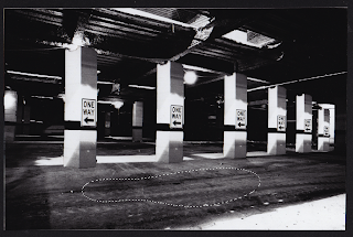
And to cap off my night of photoshop here is my deconstructed version of my image. Its still in the process. I just played with the selection tools, clone stamp tool, and manually cloaning things. So i just took a pillar and repeated it, tried to make it look realistic as possible. i took the holes in the celling and manually cloned them so there was no more holes yesaaaaa!. the last thing i did was cloned the ground to cover up the light spot in the lower left hand corner. This image can be played with so much more, so expect a final version soon. for now here this one is.

Also peep the flickr, and my classes flickr group to see what me and my fellow students are cooking up in our photoshop photo treatment madness project!
Late pauly,
expect zine coming out in july or august too, this is gunna be a wholeeeee different post, and may yield a whole other blog. For now its secrete. 

Photo Treatment project part 1

Ok so earlyer in my blog i talked about the project we were given for my art 120 class. to sum it up we take one image and do 30 diffrent treatments to the photo. Pretty much half computer bassed and half hand bassed. I chose this image to work with. Basically the contrast in it is
Perfect to work with. There is so many things i am going to do to the image. And guess what!?? i have already done three different treatments. I am going to talk about all my treatments in pretty good detail because i think process is important. This is not a project about using photoshop filters! but making our own renditions.
The First image is my solarized image. When i was in my photo class doing this manually was so sick. you pretty much took your photo out of the developer bath and ran it into white light, put it bak in the developer and it really brought out these crazy silvers!. Some chemistry terms may describe this better, but i dont know them so too bad. 
Unfortunately we are not working in the dark room, but in photoshop, where honestly the possibilities are endless. So i was playing with the curves of my image (tones and whatnot) and made a smiley face haha, i turned it to gray scale and it looked just like a solarized image. Funny how mistakes can turn out to be success sometimes. Any way, this is what a solarized image looks like in real life, dont be fooled by the stock photoshop filter its crap.

Kate/Lynda.com tutorials

Finally photoshop tutorials that are rad, and teach me something. Ok first off this has everything to do with our new project that i blogged about a few posts ago. First off... yes we learned how to do duo tones, and half tones.  This was really helpful because, well its two of the manipulations we have to do for our project. There is a lot of freedom with these and you can really do a lot. 
The next tutorial once again was by my teacher kate, and it was about the extract filter tool. This one is cool because its like a paint brush and makes it a easy to delete the background of simple images. unfortunately, my image for my treatments is not so simple, but its gunna be rad.
The next tutorials is a very lengthy one, and a very helpful one. It is all about all the selection tools
in photoshop. Each one has a diffrent use, and works better for certain things. we learned about toleration 
levels using the magic wand tool, and growing and similar selections.
we learned about refining the edges, and what how the magic wand actually works. This tutorial is really good
i think that my project has seriously been saved because of the tutorials we were given today in class! yess
So here is just something i was playing around with by selecting a post in my image and transforming it, and playing
with it.

The first one is the original, the second the one i played around with.


Monday, May 18, 2009

Photo shop tutorial

Ahh u suck at photoshop tutorial 3.
I cant help but try these out. Ok pro's it teaches you how to use
the clone tool, and manually clone stuff. this is defiantly a pro.
Cons: its impossible to find an image as perfect as this guys to do this
tutorial with. so it makes it really hard.
Once again i dont wanna post up what i did in photoshop because it looks like crap
but i know what im doing which is another pro.
So check it out. you can probably do this with any image now that i think about that.
so i did! took a broken surfboard that image i found and fixed it! haha.
manulally cloned part of the board and manipulated it using things i already knew
in photoshop or just recently learned! yay. its not really that good now that i look at it
but its the thought that counts haha


Tutorials... Photoshop


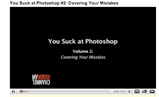
So i just did the "you suck at photoshop 2" tutorial. it was a really weird one about
like hiding a cat and putting in new carpet. after that adding a stain. it was ok but not that
good because it didint really explain much haha. but i figured it out anyway and did my own.
here is a screen cap of the intro of the video. its on youtube.com
check it out  just type in you suck at photoshop.

Photo shop project art 120 !!!

So for my art 120 class we have been given a really interesting project. 
We are going to choose one picture and manipulate it 25 diffrent ways,
after this were are going to bind the pictures up and make a book.
The begining stages of this project are to choose 3 images that we have.
They have to be images we produced. Good thing i have a gang of photos.
So i chose 4 because i was torn on one. So here they are. Be sure to check back
for process, and ultimatly the final product!
Laters,
Pauly


Ahh some of these photos were not rotated right,
Check my FLICKR if u wanna see them the right way haha

Thursday, May 14, 2009

MOREEEE photoshop tutorials.


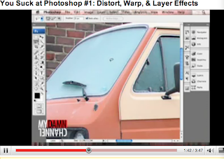
This tutorial was off of youtube. it was really funny, and pretty good.
Just go to youtube, type in you suck at photoshop, i did the first one.
It taught me how to use the skew and distort tool, play with some layer
filters. and i also combined it with using layer masks to combine images.
i just took a piece of graffitti and threw it up on a wall. pretty good tutorial
i think it was helpful to see what all the filters in the layer panels do, as well
as playing with masks. yaaaaa.
The first image is the guy leading the tutorials. he is trowing up his marriage 
certificate on his window, gotta watch the video to understand haha.